 Camera shots
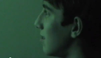
In the teaser trailer, our villain was shown through shots of his behaviour changing and through how he was emulating scenes from the video games he played. We used long shots and mid shots of our villain chasing our victim and also when he was playing video games showing how his infatuation was becoming more severe (see right).

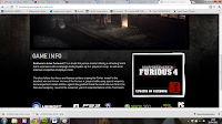
 We tried to portray the same game references on our website linking it in with conventions of a video games own website. We used the game 'Brothers in Arms''s new website as an idea for a basic layout. We then decided that we would add our poster for our teaser trailer to make sure people associated it with being a film rather than a game.
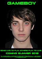
With our poster, we also tried to push across the idea that video gaming was taking over his life. For this we pixelated his eyes and mouth. This was to give the idea that he had separated himself from reality and the pixelation symbolised his connection to the gaming world.
Sound
For our teaser trailer, we used two separate songs that we edited and merged together. The music we used is from unsigned artists and we found that it was the sort of music people chose to listen to while playing games featured in our teaser. We decided against music on our website as our trailer plays when you enter so we felt it would have a negative effect to have music on the website.
Mise-en-scene
The main focus throughout our ancillary tasks was to focus on the boy, who is the protagonist. Following a typical code and convention of other real media products, we put the emphasis on the villain-like characteristics of our protagonist. We used a series of close up shots which highlighted his facial expressions. We wanted the villain to introduce the idea of infectious behaviour, as is happening with our main character through the use of video games. In order to acheive this, we used real game footage from games such as “Battlefield”, “Grand Theft Auto” and “Call of Duty”. In order to show his exhaustion from playing the games and to show his descent into gaming insanity, make up and costuming were crucial in representing the difference between the average teenage boy that he was, and the possessed young teenager he was becoming. We used red lipstick blended onto his eyes to display his fatigue.
The main character remained as the main focus of our ancillary tasks as well as gaming footage – the protagonist's disturbing image instantly displays the corruption of a teenage mind and we used the green typography on the black background to attract and convince the audience that his over indulgence in games was what led to his descent into gaming insanity.
We also used fake blood to show the damage and injuries that the victim sustained.
We used a range of scenes from different areas in the countryside which had a contrapuntal effect as you would expect the film to have an urban setting.
The use of traditional game anchorage of a black background with green writing has connotations of traditional video games such as “Space Invaders” and “Pacman”. We predominantly used this through our teaser trailer to show the confusion of the protagonist between what is real and what isn’t.
The website and poster uses the colour black as the background colour as it allows the unnerving, glowing image of the boy to stand out and intimidate the audience. The use of pixelation over his eyes and mouth is to display the idea of him believing he is in a game, and how dangerous violent video games can be.
Editing
 Using iMovie, we edited the picture quality of the teaser trailer using the exposure and contrast tools to define time of the day in most clips. We also did this on our poster to gain the brightness and colour definition we wanted on the original pictures we took. Our main aim was to improve the brightness of his face, to introduce a greater contrast with the background and green writing. Using the pixelation of the boy’s facial features allowed us to display the notion of indulging too much in games.
 For the other ancillary tasks we used different tools on Wix to change the appearance and display to show what we wanted our website to finally look like. On blogger, we continued with the theme of green writing on a black background from our trailer and website but also edited the website to have our actors eyes as a complete background as we felt this made interaction with our protagonist easier for audiences.
Typography
We used the website http://www.dafont.com/ to find a suitable font for us to use for our product. We found one called "Terminator" which we chose to use. It is heavy and block-like and is reminsicent of old style games such as "Space Invaders" and "Pacman" which would appeal to an older audience, who may have played the games in their childhood. This would link the film to these games, which would entice them to come and see the film, whilst still attracting the younger audience. We then used this font by downloading it to the iMacs and then installing it as a font. This was easier for us as we had a pre-existing knowledge of how to to work the site and how to install a font.
We then decided to go with a bright-luminous green colour as we felt this also had gaming references as it is a common colour in popular games such as "Call of Duty".
We used the same typography throughout our work, including our teaser trailer and ancillary tasks to acheive continuity and make it more recognisable.
Character Positioning
In our teaser trailer, our protagonist is shown through a variety of shots, including close-ups to be an intense character. It is unclear whether he is also the villain, as he is seen stabbing someone but the concept of him not being in control of his actions is introduced. This is shown through questions such as "Is it really just a game?" which refers to a popular saying of "it's just a game", often said when someone is upset about losing. We also included the question, "Want to play?" to involve the audience in our trailer.
The protagonist is shown in dark clothing throughout the trailer, with the majority also in low-key lighting. We then used dark clothing and a dark background in our ancillary tasks to maintain continuity and to ensure the theme is obvious.
Both the website and poster are simplistic, with a picture of the protagonist with writing and text around it. The website homepage shows the protagonist's face on with pixelated eyes and lips. This hints at the idea that he is immersed in the game and the plot of the film. The audience will most likely be taken aback when they notice the pixelation, as most people only notice when they concentrate on it, as the pixels aren't obvious at first glance.
We used the same picture for our poster as this helps link all our tasks together as one final product. This also makes the audience stop and look when they notice the pixels in his eyes. This will also hint at what the film is about whilst not giving away any clues to the narrative.


